Design Systems · 2023
Atom Design System (ADS).
Healthatom's design system. A shared language between design and engineering to build Atomlink, the platform behind Dentalink and Medilink, consistently and at scale.
- Role
- UX/UI Designer · Design System team
- Client
- Healthatom · Atomlink
- Year
- 2023
- Tools
- Figma, Storybook, React, Chromatic
- 01Product review: from 4 to 2 weeks (−50%)
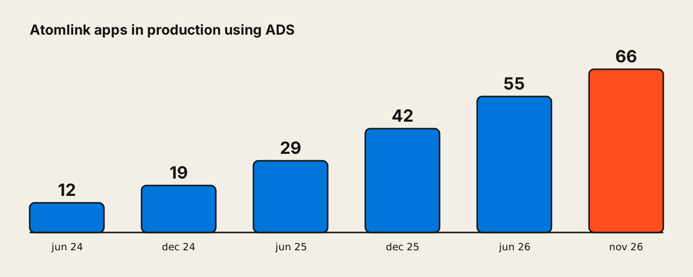
- 02From 12 to 66 apps in production in 2 years
- 031,892 files use it in production today
- 04176 published versions
The challenge
Healthatom builds several clinical software products for Latin America, and each team designed and built its screens its own way. The result: inconsistent interfaces, repeated decisions and a slow handoff between design and engineering.
Atom Design System was born in 2023 to fix that: a single source of truth for color, type, spacing and components, built for three audiences: designers, developers and the people who shape projects.
My role
When I joined there was no design system, and it wasn’t a priority: engineering was wary because some had never worked with one, and product never had time between client requests and regulation. To show what we could gain, I redesigned a single screen with one typeface, ordered spacing and colors that passed WCAG AA, and presented it to leads, heads and the company owners. The before and after convinced them to create a design system team.
The team was two developers and me; the company also hired a design lead who supported me in evaluating components. I was in charge of the system’s structure, components, documentation and maintenance, with accessibility built in from the start: contrast and text sizes for every component. I worked closely with engineering so every coded component stayed true to the design.
Foundations
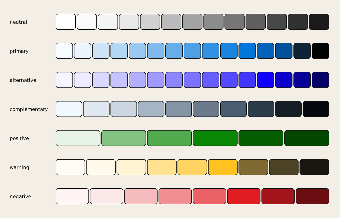
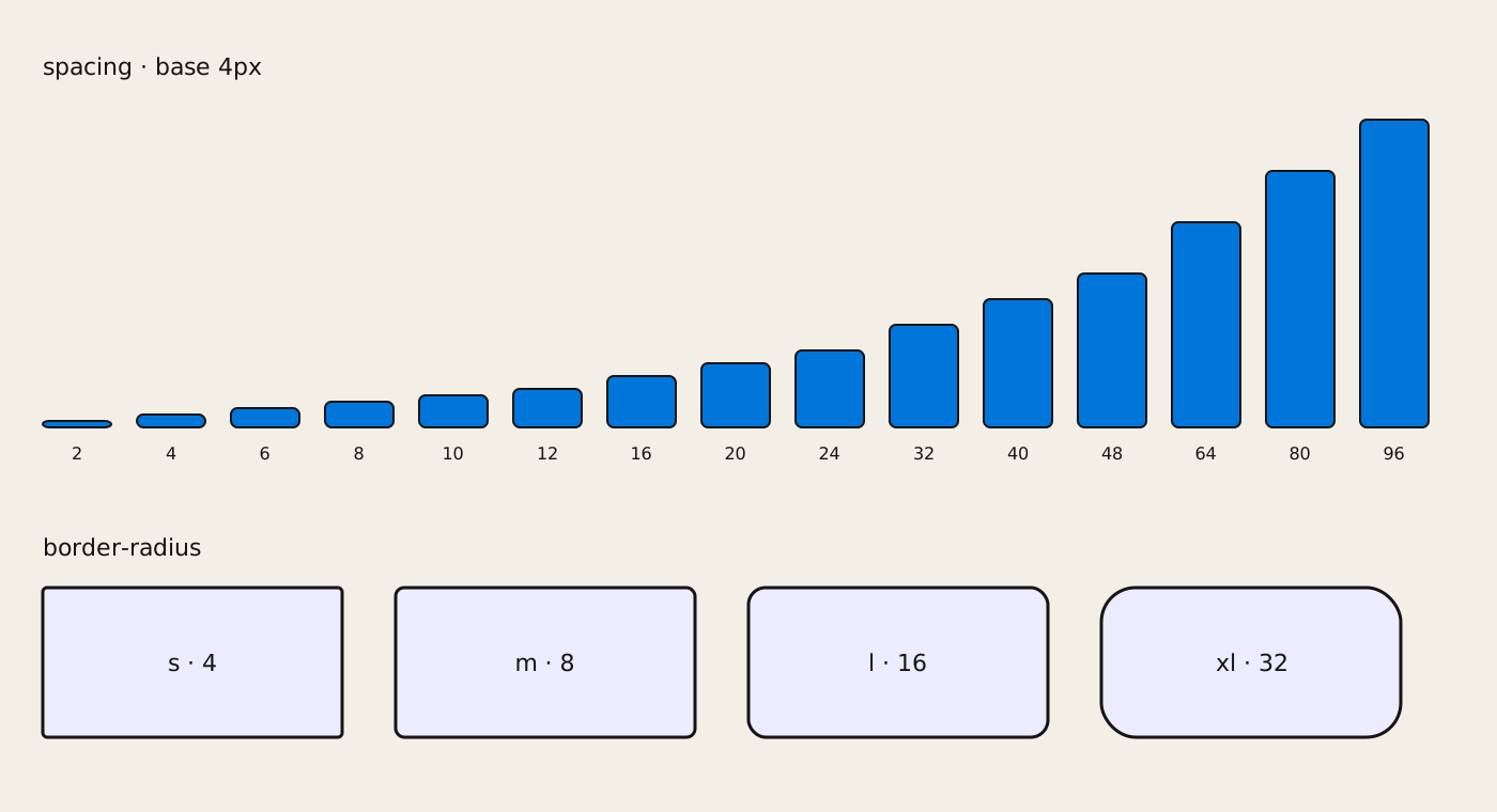
We started with the basics: a tokenized palette with 7 families (neutral, primary, alternative, complementary, positive, warning and negative), a spacing scale built on a 4px base, and four border radii. We also built accessibility in from the ground up: thinking about it from the start made it much easier to apply to every component we created.
Components
Today the system has 68 components, from the basics (buttons, inputs, tabs) to health-specific pieces like the odontogram (dental chart) or the appointment picker. Every component comes with:
- Its Figma design, linked straight from the docs.
- Storybook documentation with every prop and code examples.
- Accessibility checks and visual tests that catch unintended changes.
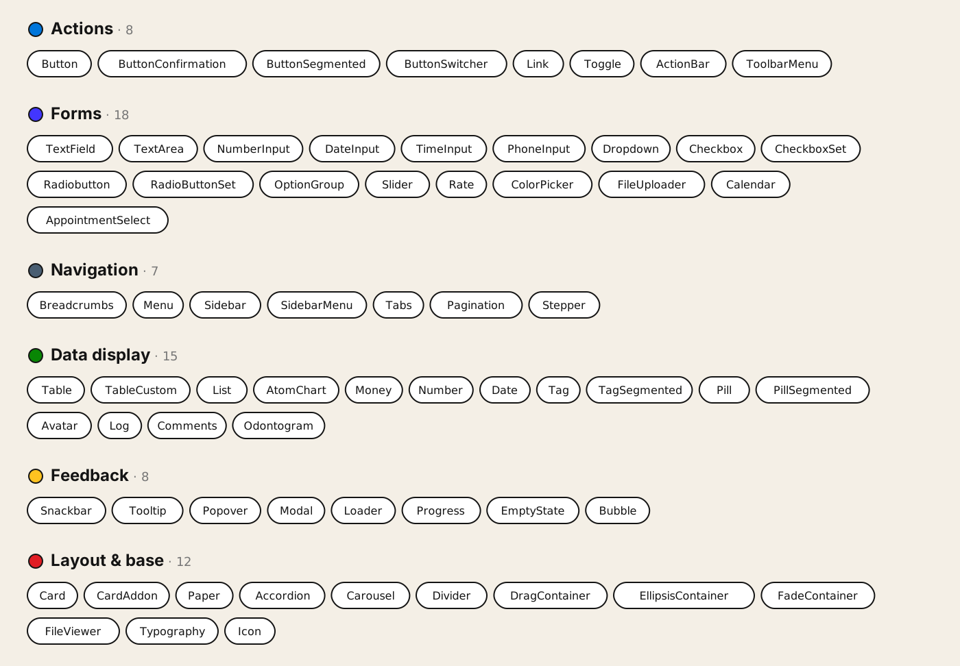
Component and prop names in design files match the code, so going from design to development is almost direct.
Growing adoption
A design system only works if people use it. Beyond the system itself, we set up its governance:
- Semantic versioning and a public changelog for every change.
- An open channel for questions and a template to request new components or report issues.
- Weekly office hours where anyone could bring their questions to the team.
Key decisions
No layout components until real patterns emerged
We ruled out shipping a grid and layout components from day one.
Why the products were just starting their redesign. Locking in a layout that early would have boxed in the first screens before we knew which patterns truly repeated, so layout was handled with flex and grid until we had that evidence.
The same names in Figma and in code
We ruled out design and engineering each using their own naming.
Why when a component and its props have the same name in design and in code, handoff is almost direct and a whole layer of translation disappears.
Accessibility from the ground up
We ruled out adding it later, component by component.
Why building it into the foundations meant every new component was born accessible, instead of being fixed later.
Impact
After launch, product review time, from design handoff to release, dropped by half: from about four weeks to two. We measured it by comparing project timelines and following up with the teams.
ADS didn’t stay in Figma or Storybook: today it’s the foundation of Atomlink. In mid-2024, 12 apps used it in production; today it’s 66, with 1,892 files of code built on the system.
On the 3.0 platform the shift is even clearer: the new apps (admin, management, CRM, academic) no longer depend on the legacy library: they’re built 100% with ADS.
Data from the Atomlink repository, November 2026.
What’s next: ADS meets AI
Today, together with Andrea Iruretagoyena, Head of Product, I maintain a design skill for Claude that knows the ADS rules and helps design and build Atomlink screens with the system. We also built a skill that audits Atomlink 3.0’s code against ADS and reports, screen by screen, what doesn’t follow the system.