Product / UX-UI · 2026
Atomlink 3.0.
Redesign
The redesign of the platform behind Dentalink and Medilink. I designed and built, end to end, the new Inventory and the guided onboardings (plus the skills that create them), and I'm now redesigning Add-on services.
- Role
- Product Designer · Design & frontend
- Client
- Healthatom · Dentalink & Medilink
- Year
- 2026
- Tools
- Figma, Atom Design System, React, VS Code, GitHub, Claude Code
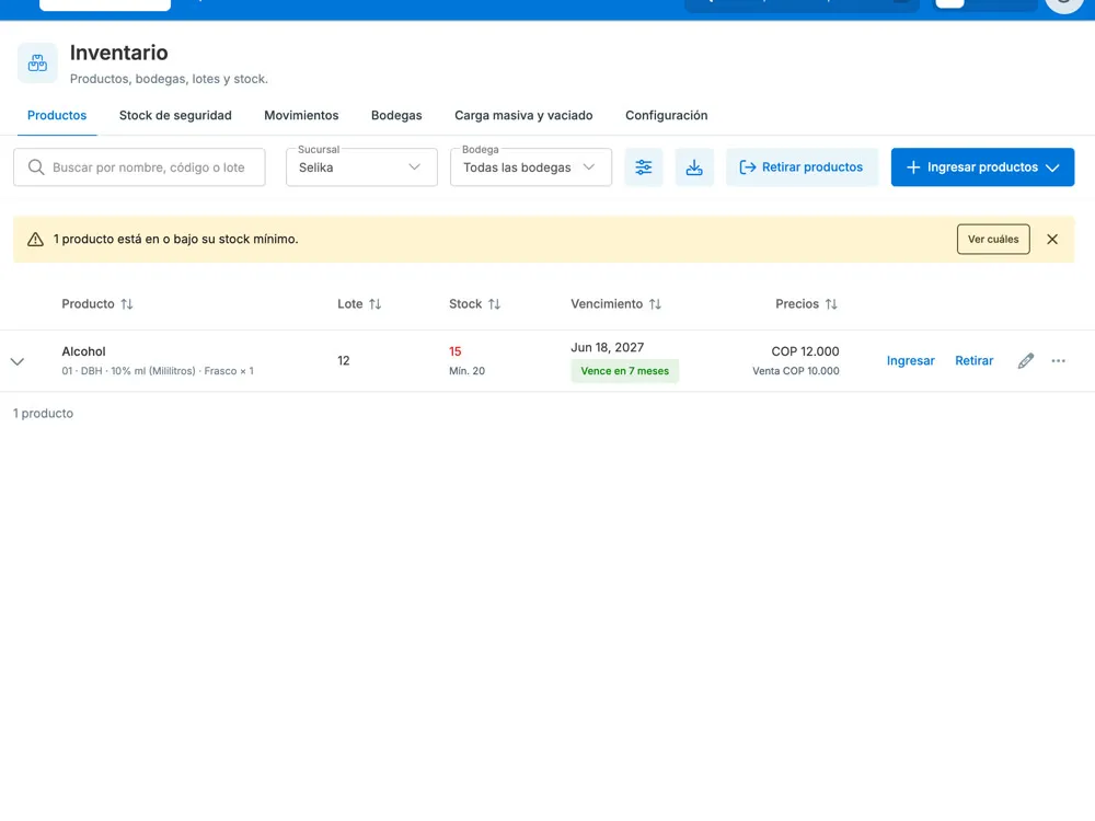
- 01Inventory redesigned and built end to end
- 02Built 100% with ADS, no legacy library
- 032 skills so any team can build onboardings
Context
Atomlink 3.0 is the redesign of the platform thousands of dental and medical clinics across Latin America use through Dentalink and Medilink. The goal: a clearer, more consistent admin, built end to end with the Atom Design System and our UX Writing guidelines.
On this project I didn’t stop at Figma: I designed and also built in code, with Claude Code as a copilot, to carry every design decision all the way to production.
1. The new Inventory
Inventory is one of the sections clinics use most, and one of the most complex: products, batches, expiry dates, warehouses and stock movements. I designed and built it end to end, with reviews from the engineering team:
- Products and stock per warehouse, with filters by expiry and stock.
- Movements you can review by day or date range, with a downloadable report.
- Warehouses at a glance: products in stock, units and last movement.
- Bulk upload and clear-out in one place, step by step, with an email when it’s done.
- A configurable expiry traffic light: you only set the red and green thresholds, and yellow is calculated for you.
- Choosing which batch stock comes from and which warehouse a product is used from during a patient visit.
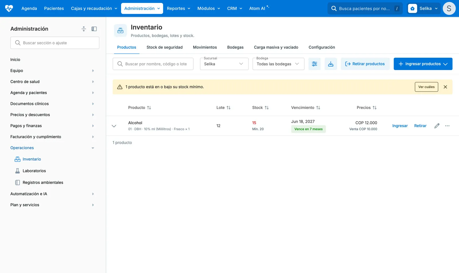
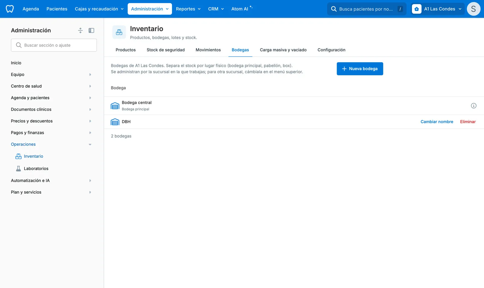
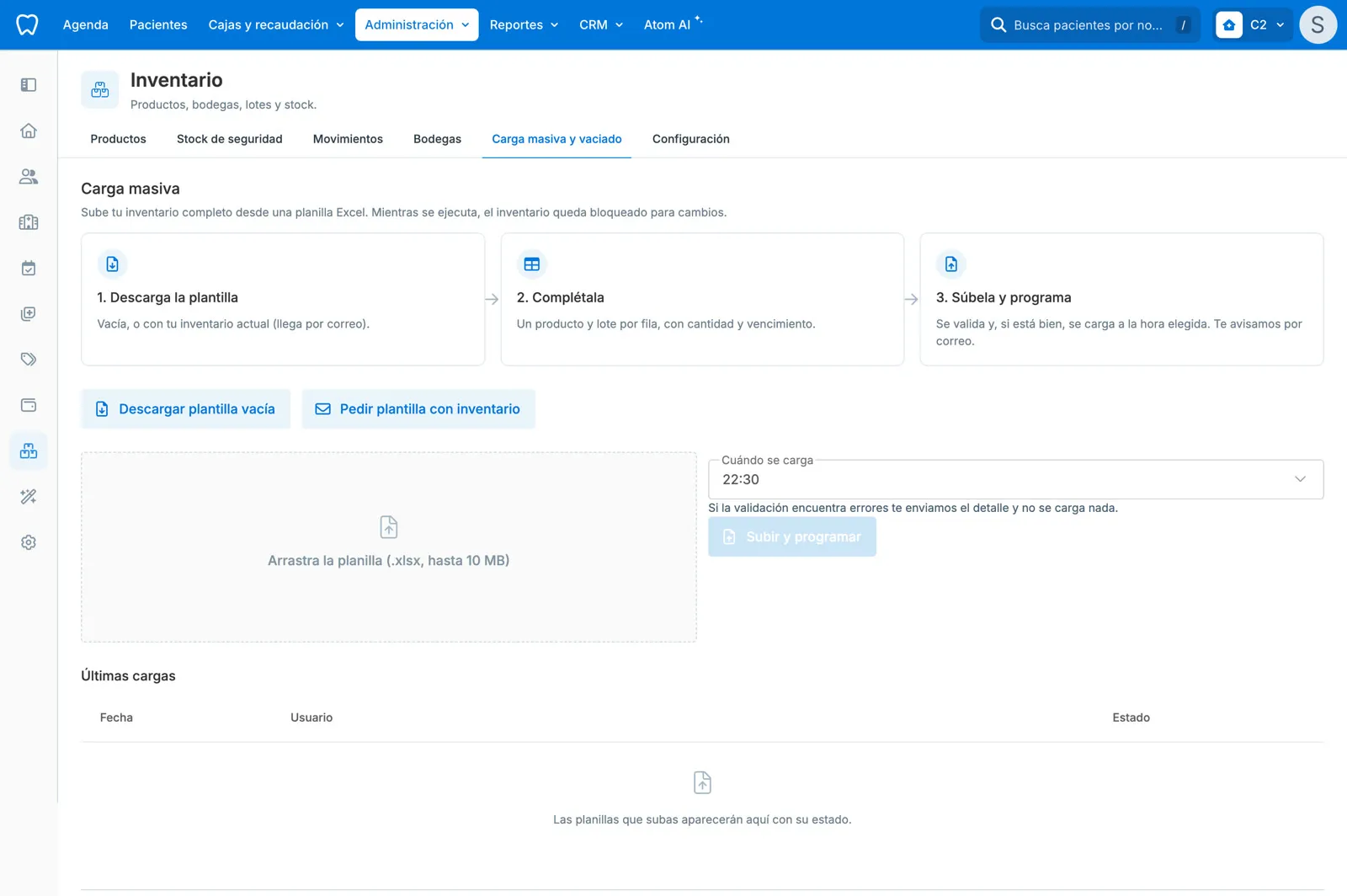
The screens are in Spanish, like the product.
Every screen went through a review against the ADS rules and the UX Writing guide: tone, consistency, error messages that say what to do, and empty states that guide the next step. I tested every case in a staging environment, for both Dentalink and Medilink.
2. Onboardings: teaching what’s new
A redesign only works if people understand what changed. So I designed and built the guided tours, following the pattern from the new calendar:
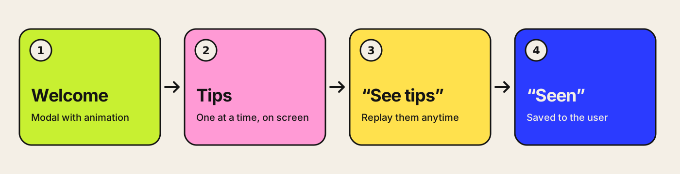
- Inventory: an animated welcome and 14 tips spread across tabs.
- The new admin: tips with a “See tips” button in the menu.
- The patient record in Medilink: its own onboarding with animation.
From a project to a tool for the team
After building several onboardings, I turned what I learned into two Claude skills that now live in the Atomlink repository:
- crear-onboarding (create onboarding): builds the tour for any new section (welcome, tips, “See tips” and “seen”). It’s designed so a designer or PM can request it without being a developer.
- crear-animacion (create animation): turns a Figma frame or an idea into an animation ready for the welcome modal, with a script that gets approved before anything is built.
The pattern no longer depends on me: any team can introduce its new section the same way.
3. Add-on services (in progress)
I’m currently redesigning the section where clinics discover, purchase and activate add-on services: the service catalog, the detail page with its summary, purchase and activation, contact requests, and setting up integrations like e-invoicing and WhatsApp.
Key decisions
Only two traffic-light thresholds are typed; yellow is calculated
I ruled out three editable fields, one per color.
Why with three thresholds it was easy to leave them out of order or with gaps between colors. With two, the system calculates yellow, and any error shows up right on the threshold that needs fixing.
One tour per tab, with “seen” saved to the user
I ruled out one long tour for the whole section, saved in the browser.
Why each tab teaches its own features the first time you open it, instead of a long walkthrough nobody finishes. Saving it to the user keeps the tour from reappearing when you switch computers.
Bulk upload sends an email when it’s done
I ruled out leaving people waiting in front of a progress bar.
Why a large spreadsheet can take a while. With clear steps and an email notification, people keep working and come back when it’s ready. If something fails, the message says what to do, not an error code.
What I learned
Designing and building at the same time changes the conversation: the details that used to get lost in handoff (a spacing, an empty state, a line of copy) now reach production exactly as designed.